All the Colors in the Palette
I have always had a box of gemstones. It is an ever-changing assortment of colorful stones, comprised of acquisitions I purchased, with only a vague idea of how I might use them, or a design I’ll create. Most of the time, I buy what I like and know the rest will work itself out later… sometimes much later.
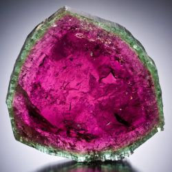
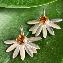
At the beginning of my career as a designer, I was drawn to the clear, bright colors of purple amethyst, chartreuse peridot, and magenta rubellite tourmaline. I added in golden beryls and sunny orange citrines as warmer counterpoints. At that time, these stones were readily available in calibrated sizes and colors. This allowed me to create a design model that used a specific size gemstone and it would be reproducible with the supply of stones I had access to. This saves the costly effort of creating a new model for each new stone for each new piece.
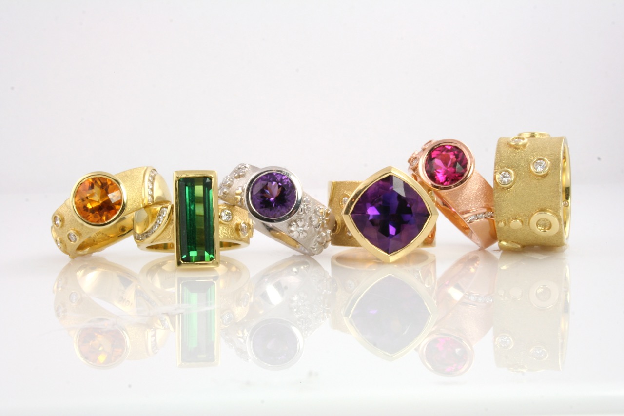 ABOVE-TIME + SPACE COLLECTION RINGS, WITH WHITE GOLD HAIKU RING, CIRCA 2007, LEFT TO RIGHT: CITRINE, GREEN TOURMALINE, AMETHYST, AMETHYST, RUBELLITE TOURMALINE. ASHLEY CHILDS PHOTO.
I had opened many wholesale accounts at that point, and most of the stores wanted the same offering of rings. It was very important to be able to deliver a collection that matched the samples the buyers had seen at a show months before. As a new designer and graduate gemologist, I took great pride in offering my designs using only the highest quality gemstones.
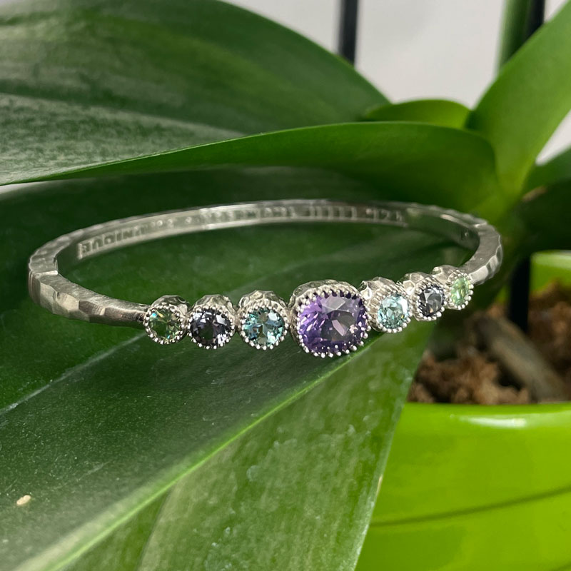
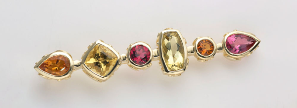 Time + Space Brooch, circa 2006
left to right; Citrine, Golden Beryl, Rubellite Tourmaline, Golden Beryl, Citrine, Pink Tourmaline
As I began my adventures through the American West, I was invited to show my work at Creighton Block Gallery in Big Sky. Montana. The gallery primarily represented the paintings and sculptures of artists working in the wildlife and traditional American West genres. I was the only jewelry and buckle designer they represented. Visiting the gallery, I was captivated, especially by the paintings. I learned about the artists, their subjects, and their techniques. The way the artists used paints and brushes to create effects from hyper-realistic to looser, more conceptual or impressionistic works, resonated with me strongly. I was drawn to diverse styles that all had a masterful use of color. These pigments, mixed with a subtle and intuitive approach, profoundly changed how I look at the landscape and see the light around me.
I continue to study paintings and painters. Strolling galleries in Jackson Hole, Big Sky, and Bozeman, not to mention Western Art Week in Great Falls, Montana is one of my favorite things to do. “Quickdraw” events are captivating. Attendees get to walk around and watch the painters at work. Typically the finished paintings are auctioned off the same evening (still wet!). Seeing a sunset across the Western plains come to life with paint on canvas is magical.
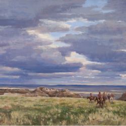
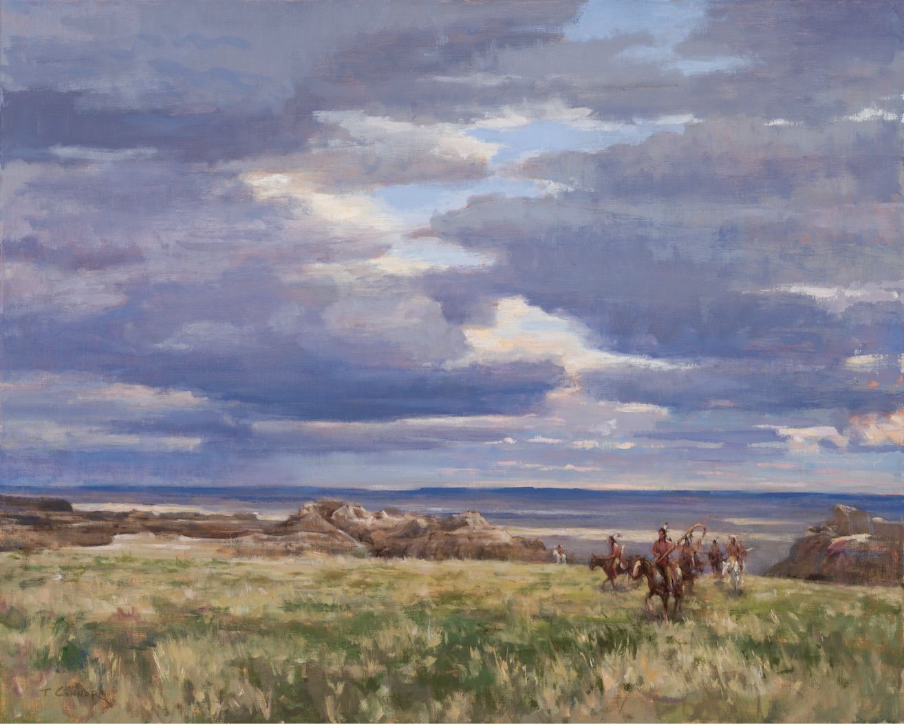
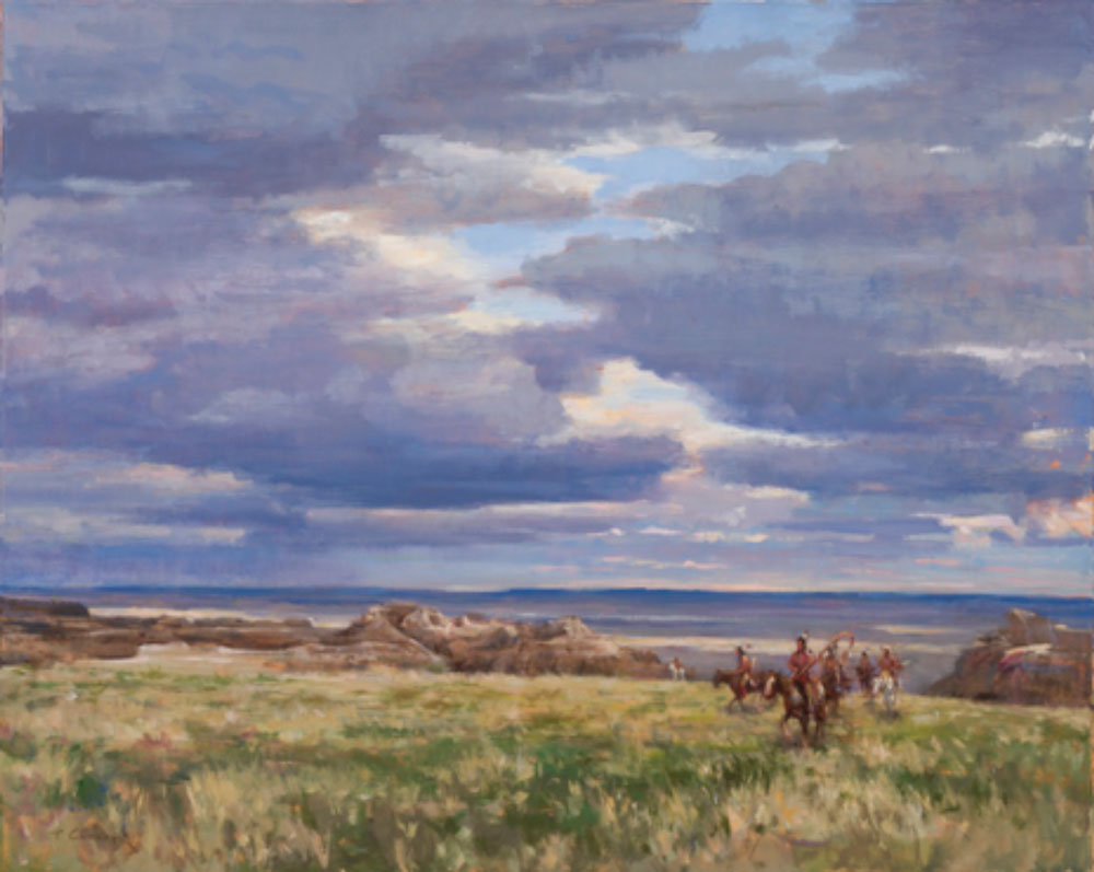 Land of the Lakota, Todd Connor, 24 x 30, oil on canvas, 2018
Over the years, I found the way I interact with color has changed. I see it differently. It has become a primary source of inspiration, not merely a way to color inside the lines and spaces of a design. While I love to highlight a beautiful colored gemstone as the centerpiece in a pendant or ring, I am drawn to the complex relationships between colors I can express using a variety of colorful gems in a design.
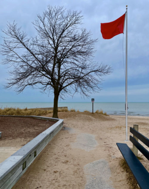
As I walk through the city or hike in the mountains, the colors I am drawn to are often unexpected. The coastline hues of winter are shades of moody blue, dry, grassy yellow, sandy taupe, and rich brown of shaded tree bark. I see the harmony in these tones yet, each color can be seen distinctly if I chose to look closely. I see how the scene of earthy beach shades is punctuated by a touch of vibrant red- like the warning flag that spends the winter, waving across the closed beach. I internalize these views, holding them as memory, leaving them to reappear as inspiration later.
I take gemstone breaks throughout the week. I look through the drawer, shuffle the small white boxes housing the gems, and lay out different combinations, considering the variety of ideas, that spill out onto my work table. One day I might take out all the blue stones, and another day I might take out all the matched pairs of stones. It was on such day, that the little boxes with pairs of stones of various colors and shapes seemed to arrange themselves in a graduated array that I found both unusual and attractive. I shuffled a few more combinations in and out of the arrays on the sorting tray until the final combination satisfied me.
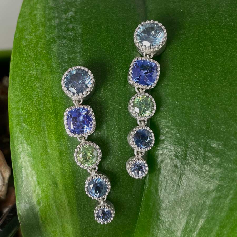
The stones for the first pair of Cascade Earrings were ready for the next step! It was the serendipity in the way the stones were arranged in the box that allowed me to see the first pair as a possibility. All I had to do next was muster the courage to bring them to life. The original array was comprised of cushion-cut straw yellow zircons; round zoisites in a zoned gray-purple-green color; round violet spinels; square cushion cut pink garnets, round aubergine spinels; round gray-green demantoid garnets; and the exclamation point on the end: tiny round red spinels. (see photo below)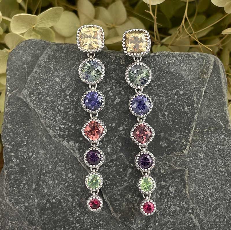
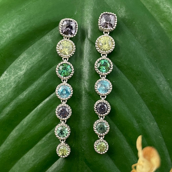
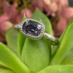
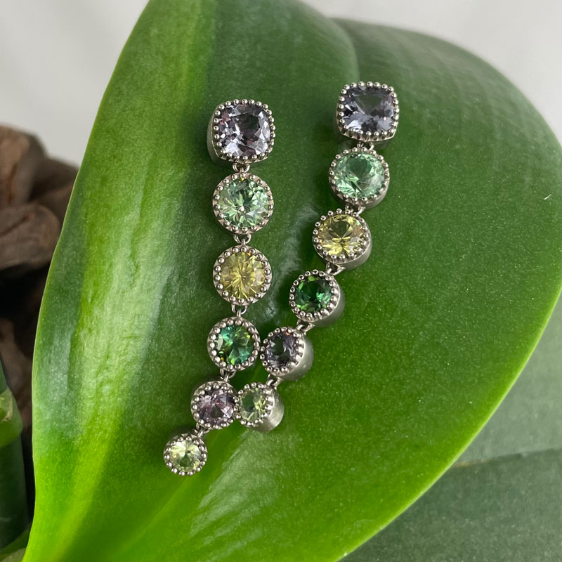 Cascade Earrings, circa 2022,
top to bottom: Gray Spinel, Green Garnet, Mali Garnet, Green Tourmaline, Gray Spinel, Demantoid Garnet
The idea took hold and the box of stones gave up many more combinations. I have also had wonderful times opening the box of gems for my clients to enjoy the process of finding an array of colors that speaks to them! Sometimes it’s a simple duet of two stones drawn together. Other times, it’s a tonal celebration of a single hue or color family that comes forth to be combined. The resulting earrings are simple, yet sophisticated. They provide a unique element of personal style.
What’s your favorite color?
